Creating an eCommerce Experiance
Melbourne is one of Australia's most bike friendly cities. With over 21,000 residents riding their bike on a weekly basis and half of all households owning at least one working bicycle, the market for bike services, repairs, and sales has become highly competitive
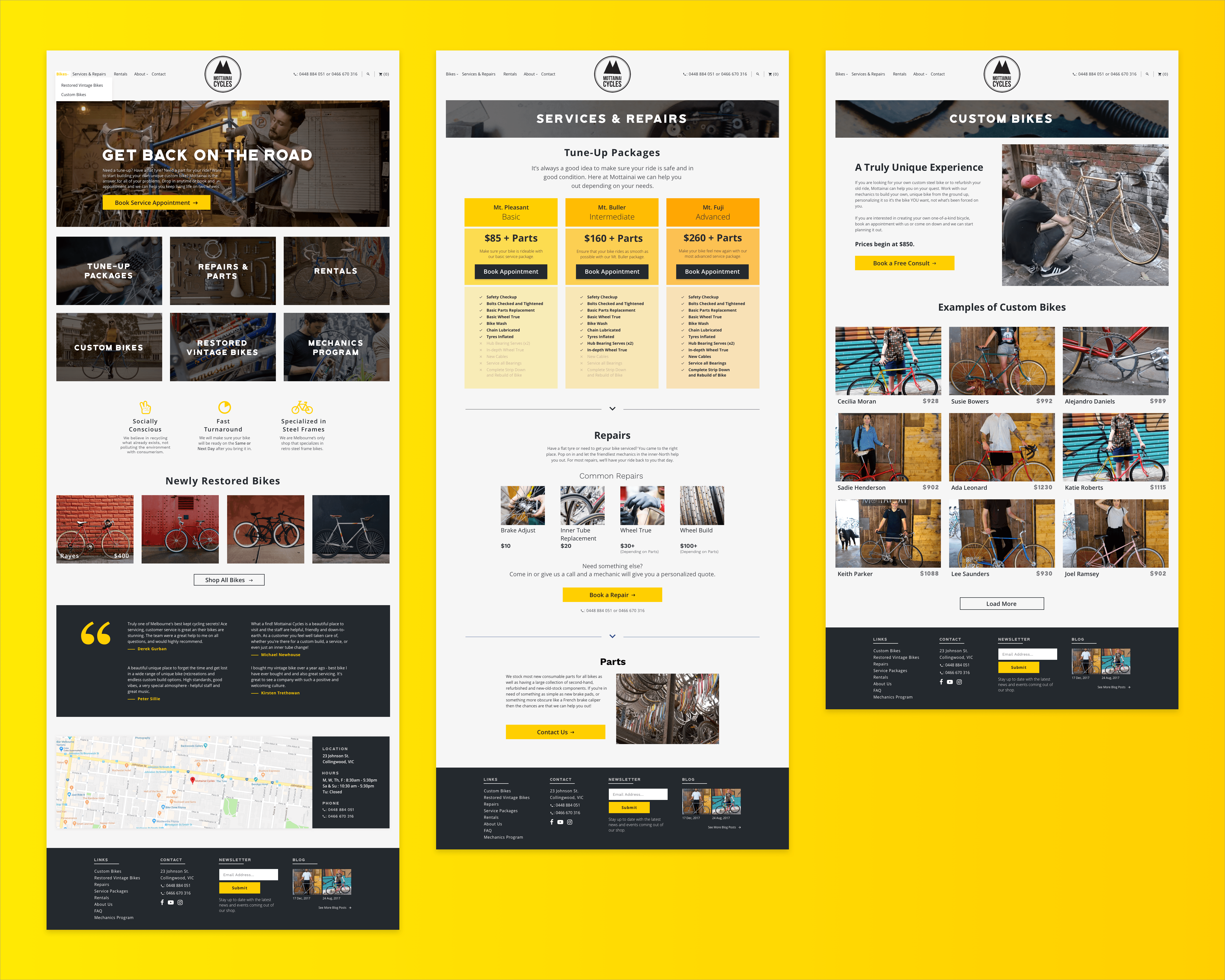
Mottainai Cycles is a small, independent vintage bike restoration and repair shop located in Melbourne, Australia that began in the owner's backyard shed in 2007. Mottainai Cycles main goal is to recycle and restore vintage steel frame bikes, however they have found that the majority of their business is repairing and servicing bikes for members of the community. While they have a loyal customer base, they have found it difficult to increase this base as well as increase bike sales.
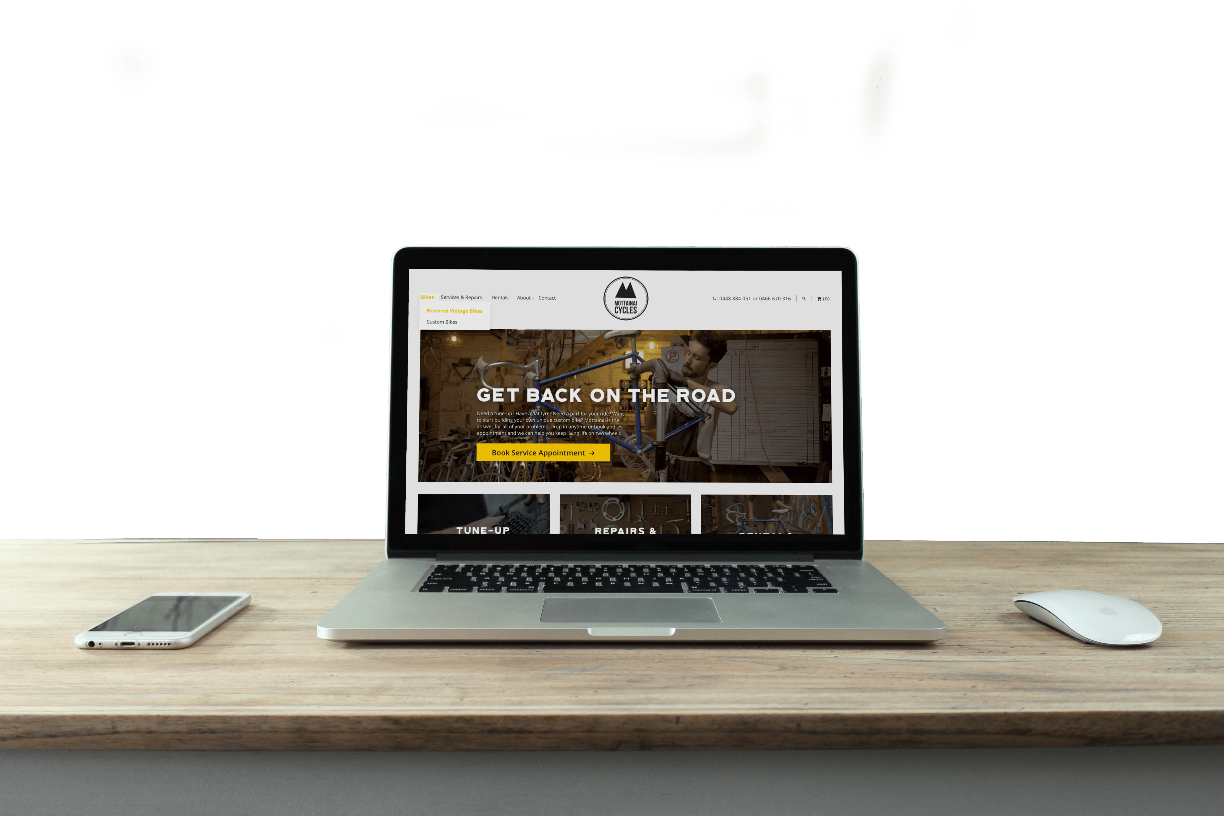
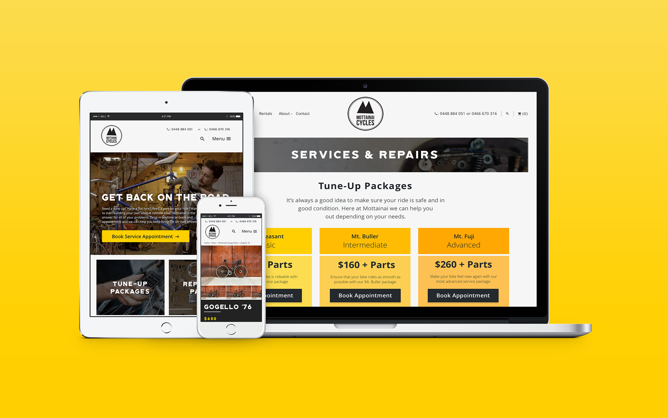
I explored motivations around the usage of bike shops for bike repairs as well as attitudes around purchasing bikes. I used this information to create a solution that would not only help Mottainai but also every bike rider of Melbourne. Mottainai Cycles is a responsive e-commerce website that is devoted to getting rider's back out on the road.
1. Bike riders need to quickly and easily fix or service their bikes.
2. Prospective buyers need to learn more about Mottainai's vintage restored bikes and custom bikes.
3 Weeks
I talked with numerous individuals whose daily bike use ranged from seasonal to daily and whose knowledge of bike repair ranged from none to the ability to fix a flat tire. From my one-on-one interviews, I discovered that price and build quality were critical when people made the choice of where to take their bike in for repair.
The vast majority of people said that the primary reason they would go to a bike shop would be for a repair, and while they would be interested in custom bikes or a restored bike they were worried that the cost would be overly prohibitive. For me, this information made it clear that while I needed to clearly show the prices and benefits of custom bikes, I would need to first and foremost focus on the repairs and service packages side of Mottainai's web presence.
I also conducted a competitive analysis of competitors in the bike sales and repair space in Melbourne. This analysis was helpful in that it clearly identified that Mottainai was the only shop to offer custom bikes, restored vintages bikes, and repairs. It also showed an opportunity in that very few competitors had adopted an online booking platform for repairs or tune-ups. This gave me the idea that this might be a way to help distinguish Mottainai and make the user's experience much easier.
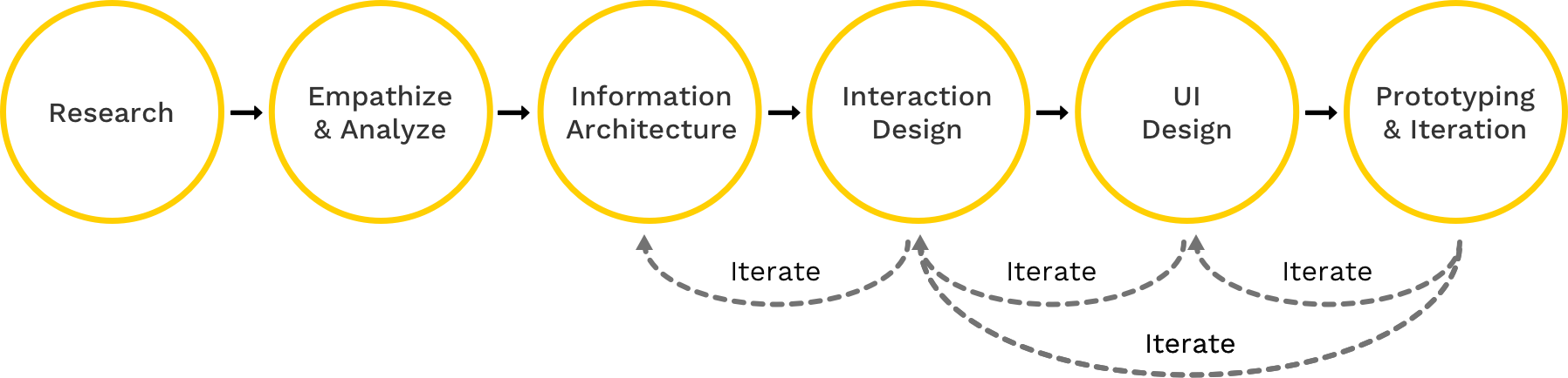
Taking the information I gleaned from my competitive analysis and individual interviews, I developed a persona, Neil Morris. I focused this persona on the use-case of getting a bike serviced/repaired, as my research showed that this was the primary use case that bike riders would experience as well as making up a majority of Mottainai's business.
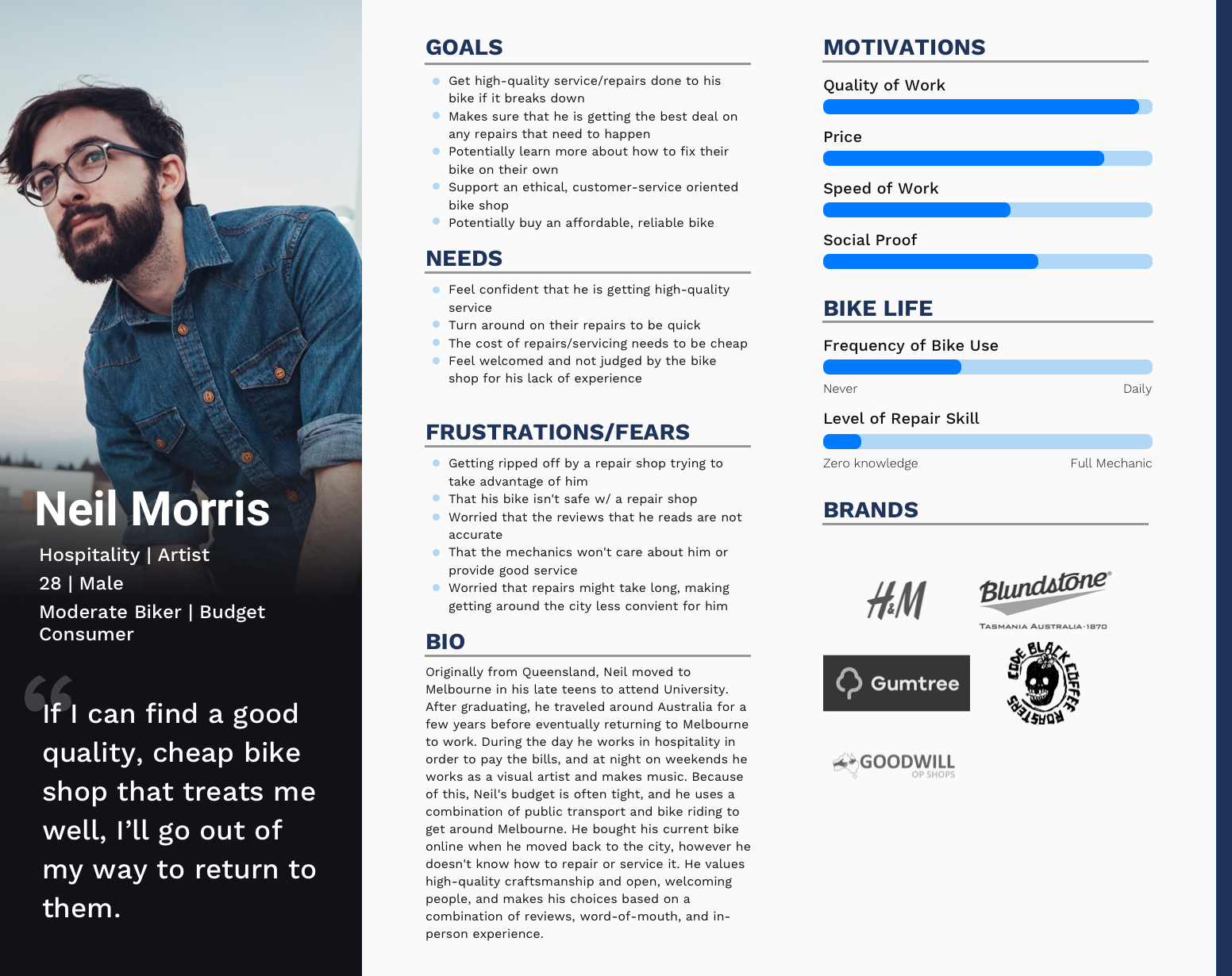
To start, I used my primary research data to populate Neil's goals, needs, frustrations, and fears, as well as metrics to understand his current bike usage. This further helped me crystalize how important it would be for Neil to be able to quickly and easily see what services and repairs were offered and at what price. Neil also wanted to make sure he was getting a good value for the cost of his repairs in a shop that he ethically agreed with.
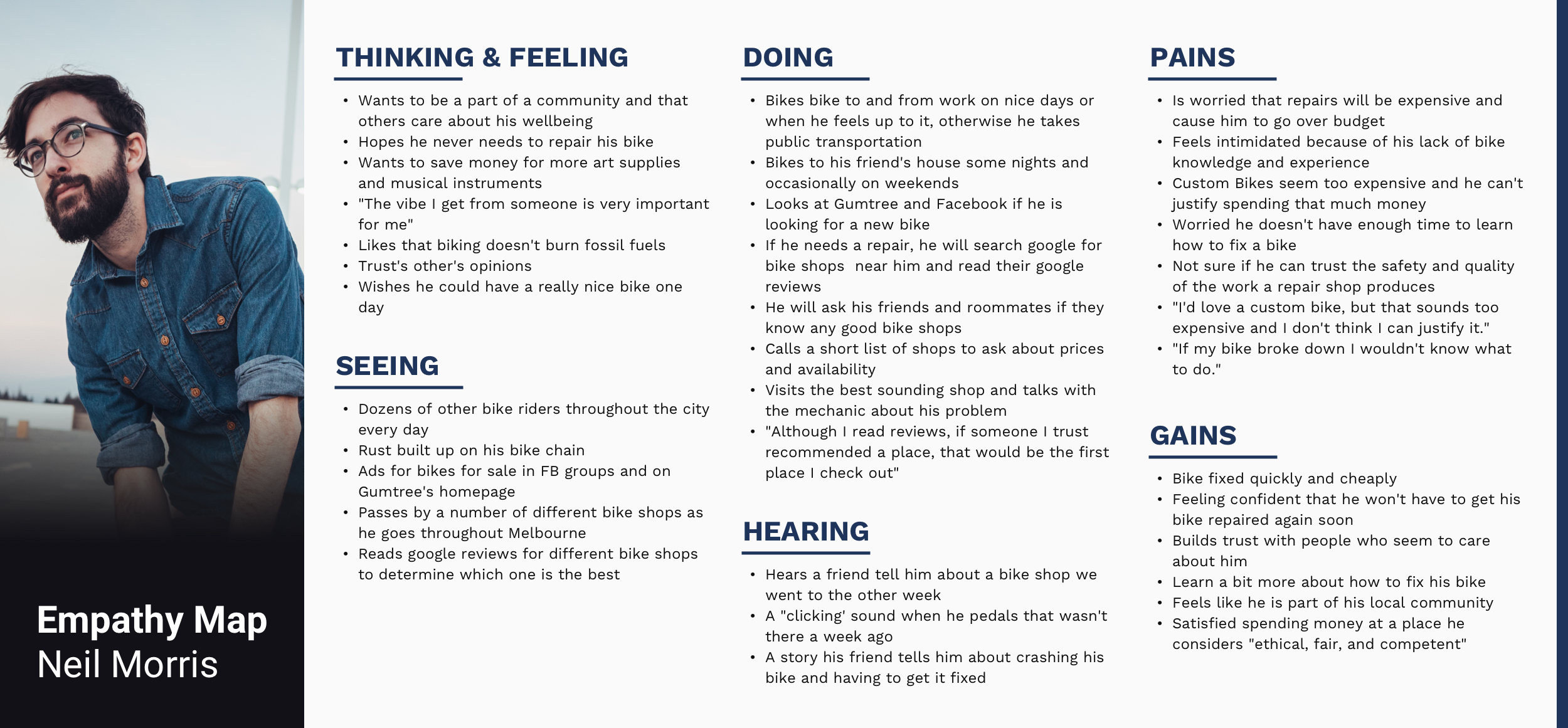
Taking this information, I then created an Empathy Map for Neil in order to better understand his life and needs more holistically. Again, it became very clear that for Neil there were a few core values that were critical to his journey in interacting with a bike shop: Price, Trust, Value, and Customer Service.
After having a better empathetic grasp on Neil, I developed a list of potential features I could include in the product. These features, such as service packages, a blog, and repair costs came directly from a combination of my one-on-one interviews, stakeholder interviews, and competitive analysis.
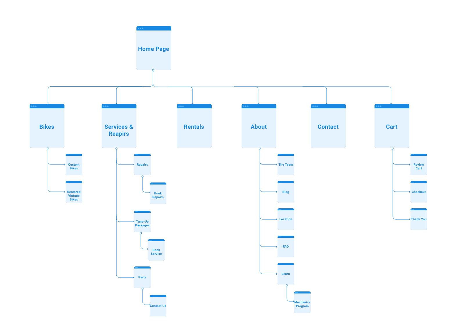
Taking this list, I used my information gleaned from Neil and my stakeholder interviews in order to rate each feature on its desirability to users, its feasibility to implement quickly and effectively, and how it aligns with the business goals of Mottainai. I used this information to build a Site Map.
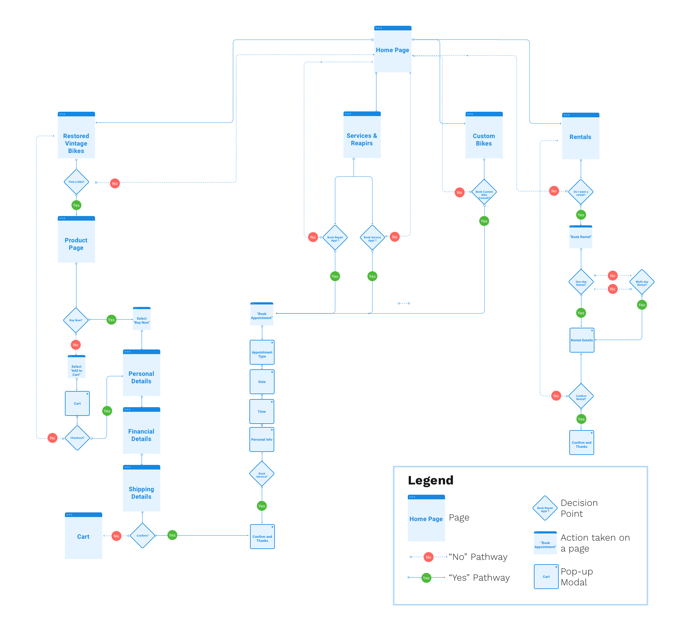
After grasping the architecture of the site, I set out to design a User flow for the main use-cases that arose in my research. It was important that users could easily and very quickly find the prices for the services that they wanted and then quickly book an appointment. The less friction the better.
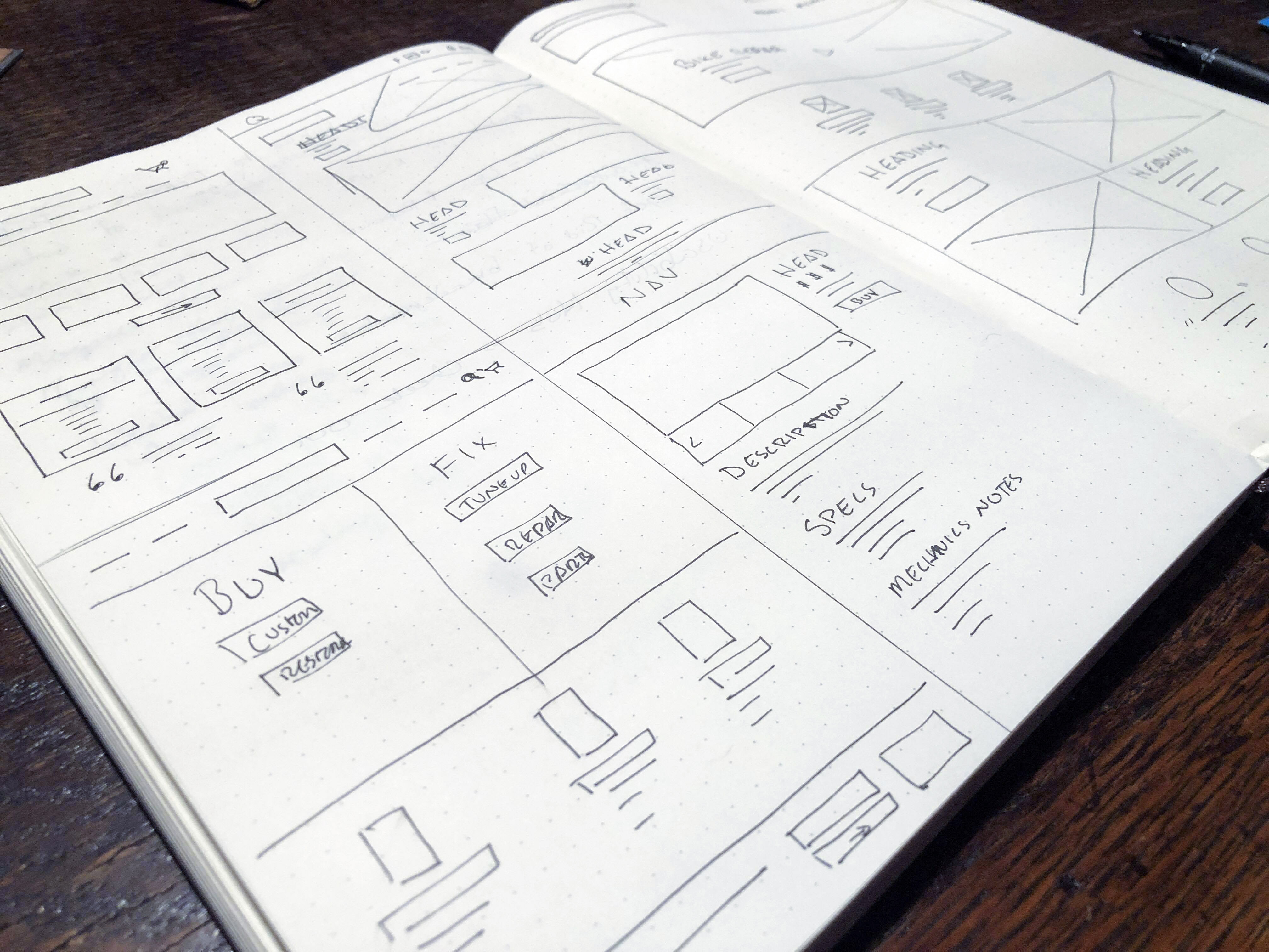
After establishing an interaction design pattern that helped Neil achieve his goals, I then set about designing wireframes. I started off with simple pen-and-paper sketches of different pages and patterns, iterating quickly and exploring different possibilities.
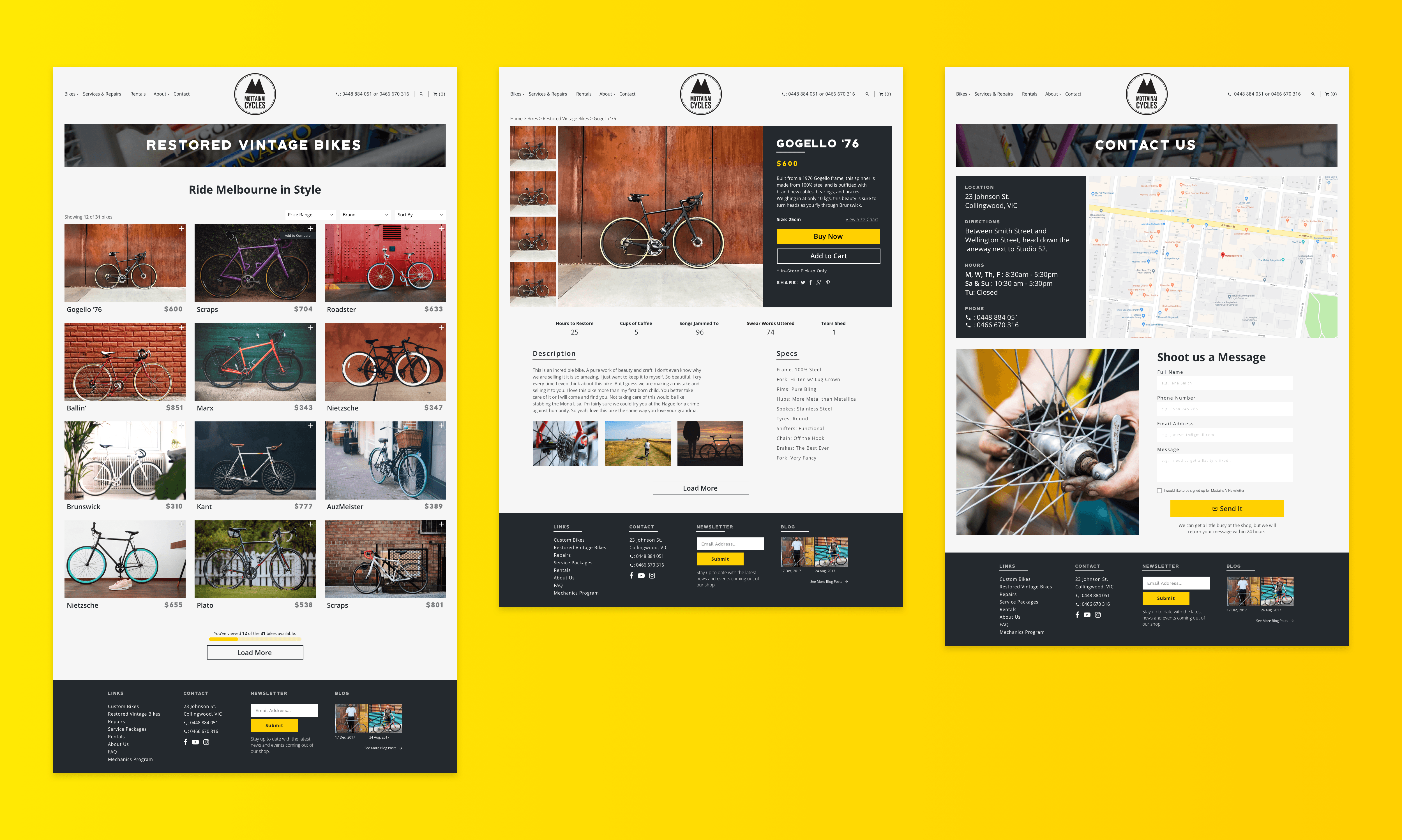
I then moved onto low-mid fidelity wireframes. I aimed these wireframes at focusing on the key values that Neild had in his journey while also offering quick navigation to repairs/services and the ecommerce section of the site.
A key component of my design was an appointment booking system as this would allow users to quickly and easily set up a time to fix their bike that worked for their schedule. I am a fan of using available resources whenever you can, and so when trying to design the best appointment booking flow I could, I turned to Calendly. The UX of Calendly is top notch, and after discussing it with the stakeholders, we decided to incorporate Calendly as our appointment booking system.
Why try to re-invent the wheel when this solution saves everyone time, money, and a lot of headaches.
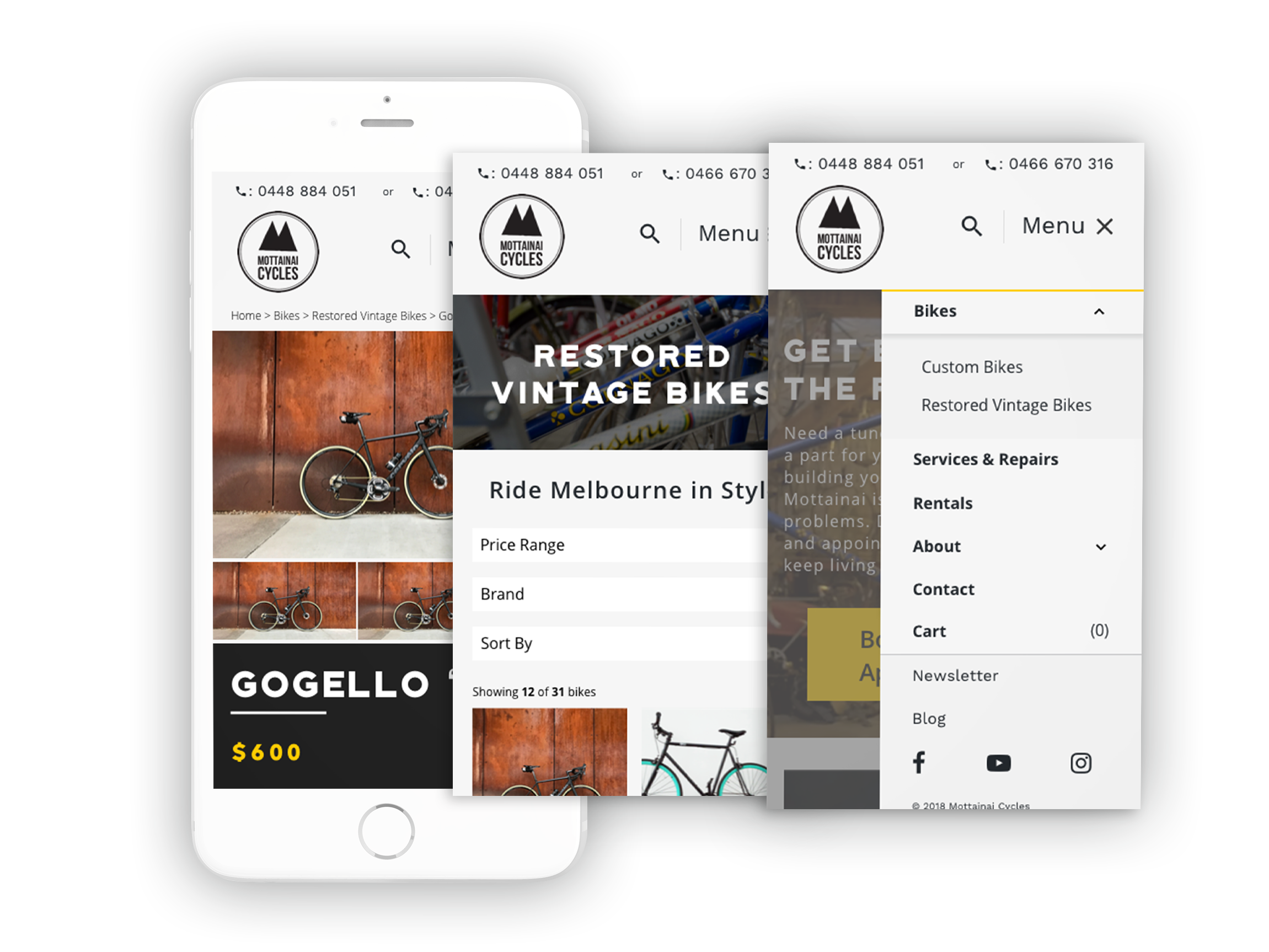
After competing a draft of my wireframes, I used InVision to create a clickable prototype. I invited 4 participants to user test the site to work out any issues that might exist at this early stage. Using the results of these test, I created a affinity map. And low and behold, major issues emerged.
Primarily, there was a lot of trouble with navigation and discoverability. Numerous users were using the home page as their main source of navigation rather than the navigation menu, and numerous users commented on a lack of clarity in how some of the information was displayed. Indeed, it could sometimes take users a couple of tries to find out how to get to the right page.
I realized then that I would have to do some major revisions in order to make my design solve my problem better and be as useful as possible to potential users in the future.
With this data in hand, I went back and reconfigured my wireframes considerably. I reworked my navigation menu and header to be more approachable and easy to understand. Having seen so many users try to use the landing page as their main portal for navigation, I redesigned the layout of the page to help support this behavior. I also clarified the display of information and focused on making my visual hierarchy stronger based on a combination of user feedback and observations I made in my usability tests.
After making significant design changes and developing a high-fidelity comp, I wanted to validate my new design direction. Thus, I created another hi-fidelity prototype in InVision, and conducted 4 usability tests in order to validate or invalidate my design decisions.
These tests validated my new navigation system, with users now using both the navigation menu and landing page equally as portals of navigation. Users no longer spent seconds exploring the page looking for the right link, but were able to instantly go to the page they needed. When asked to discern between information when making choices, users across the board were able to arrive at answers and take action significantly faster than before. Users were also much more likely to comment on how much they enjoyed exploring the website and booking an appointment.
There were some issues remaining however. Numerous issues with the tone of my copy were pointed out, and users mentioned some clarity issues with a few of my CTAs. Taking all of this new information, I further iterated my designs, focusing on making my copy more concise and powerful while also clarifying my CTAs so that users wouldn't have to think to understand what they do.
I wanted to keep the MVP of this site fairly straight forward and focused on allowing users to accomplish their most important tasks. After this is accomplished, there are a few more features I would like to add:
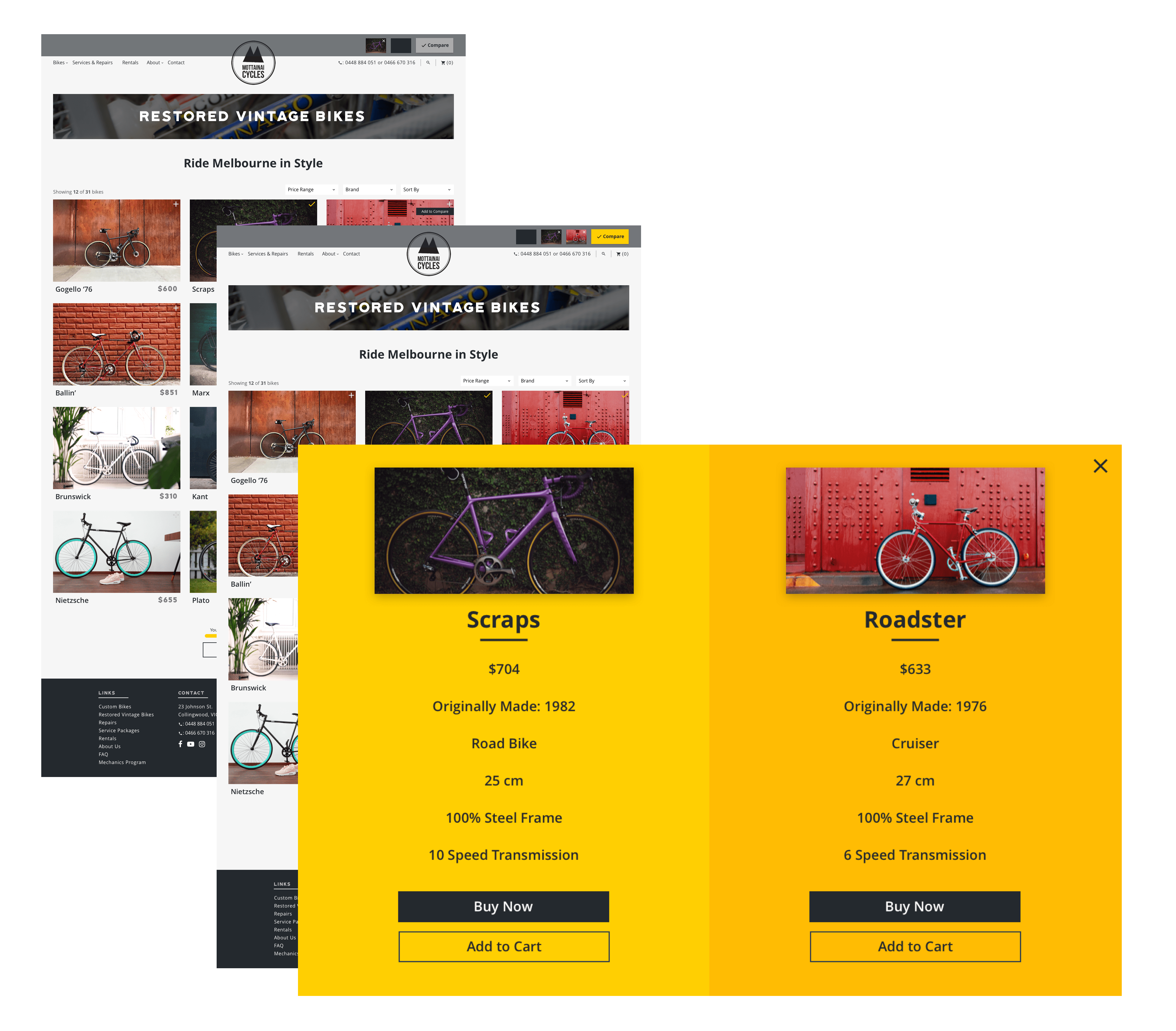
Comparison feature - Buying a bike is not an easy decision, and users are often faced with a wide range of choices to make. In order to reduce the cognitive load of trying to compare multiple specs in their head at once, I would like to implement an easy to use comparison feature that would hopefully allow users to make easier and better informed purchases.
In-Browser Bike Customization - Right now, the only way for a user to purchase a custom bike is to come to an appointment in person to discuss their wants with a mechanic. This is a major pain point, as it requires a large time and energy commitment from the user with no guarantee that they will find something that they like. By implementing a feature that allows users to build a custom bike out of the shop's available parts in their browser, it will greatly ease this pain point and greater incentivize users to follow through and purchase their own custom bike.
Live Customer Chat - In order to keep a focus on providing the best customer service support possible, implementing a live customer chat would go a long way towards reducing the knowledge gap many users might have. This feature will help alleviate the current pain that exists when new users are having to decide which service or repair their might need.
Test early, test often. In this project, I did my best to base my initial wireframes and designs on the research and empathy that I had developed. However, my initial user tests showed that even with this information I still had major issues. By taking into account the information gleaned from these usability tests, I was able to keep iterating and eventually come up with a successful design that allowed users to complete their goals.
Good UX writing isn't always seen, but bad UX writing is always seen. As a new acolyte of UX writing, I was shown the light in how critical good copy is when considering the UX of a product. In areas where my copy worked, there were never issues and users accomplished tasks seamlessly. However wherever there were issues, it immediately prompted hesitation and confusion. In order to have a positive experience, every word has to be carefully considered.
This project taught me an immense amount about how my designs are not precious but rather infinitely malleable to the results of real world tests. I've learned so much about the value of keeping my design decisions human-centered while also making sure they synchronize with business strategy. I still have a lot to learn along my path as a UX Designer, but this has taught me an incredible amount about how to use the UX process to find solutions to your problems.